Differences Between the VIX Index And At-the-Money Implied Volatility

When trading options, we often use the VIX index as a measure of volatility to help enter and manage positions. This works most of the time. However, there exist some differences between the VIX index and at-the-money implied volatility (ATM IV). In this post, we are going to show such a difference through an example. Specifically, we study the relationship between the implied volatility and forward realized volatility (RV) [1] of SP500. We utilize data from April 2009 to December 2018.

Recall that the VIX index

  • Is a model-independent measure of volatility,
  • It contains a basket of options, including out-of-the-money options. Therefore it incorporates the skew effect to some degree.

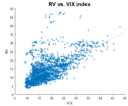
Plot below shows RV as a function of the VIX index.
Volatility trading strategies volatility arbitrage

We observe that a high VIX index will usually lead to a higher realized volatility. The correlation between RV and the VIX is 0.6397.

For traders who manage fixed-strike options, the use of option-specific implied volatilities, in conjunction with the VIX index, should be considered. In this example, we calculate the one-month at-the-money implied volatility using SPY options. Unlike the VIX index, the fixed-strike volatilities are model-dependent. To simplify, we use the Black-Scholes model to determine the fixed-strike, fixed-maturity implied volatilities.  The constant-maturity, floating-strike implied volatilities are then calculated by interpolation.

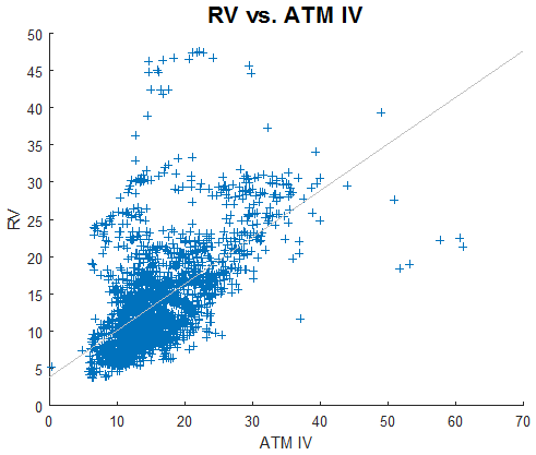
Plot below shows RV as a function of ATM IV.
Volatility trading strategies implied volatility

We observe similar behaviour as in the previous plot. However, the correlation (0.5925) is smaller. This is probably due to the fact that ATM IV does not include the skew.

In summary:

  • There are differences between the VIX index and at-the-money implied volatility.
  • Higher implied volatilities (as measured by the VIX or ATM IV) will usually lead to higher RV.

Footnotes

[1] In this example, forward realized volatility is historical volatility shifted by one month.

Is Asset Dynamics Priced In Correctly by Black-Scholes-Merton Model?

A lot of research has been devoted to answering the question: do options price in the volatility risks correctly? The most noteworthy phenomenon (or bias) is called the volatility risk premium, i.e. options implied volatilities tend to overestimate future realized volatilities.  Much less attention is paid, however, to the underlying asset dynamics, i.e. to answering the question: do options price in the asset dynamics correctly?

Note that within the usual BSM framework, the underlying asset is assumed to follow a GBM process. So to answer the above question, it’d be useful to use a different process to model the asset price.

We found an interesting article on this subject [1].  Instead of using GBM, the authors used a process where the asset returns are auto-correlated and then developed a closed-form formula to price the options. Specifically, they assumed that the underlying asset follows an MA(1) process,

volatility trading strategies mean reverting asset

where β represents the impact of past shocks and h is a small constant. We note that and in case β=0 the price dynamics becomes GBM.
After applying some standard pricing techniques, a closed-form option pricing formula is derived which is similar to BSM except that the variance (and volatility) contains the autocorrelation coefficient,

volatility trading strategies trending asset

From the above equation, it can be seen that

  • When the underlying asset is mean reverting, i.e. β<0, which is often the case for equity indices, the MA(1) volatility becomes smaller. Therefore if we use BSM with σ as input for volatility, it will overestimate the option price.
  • Conversely, when the asset is trending, i.e. β>0, BSM underestimates the option price.
  • Time to maturity, τ, also affects the degree of over- underpricing. Longer-dated options will be affected more by the autocorrelation factor.

References

[1] Liao, S.L. and Chen, C.C. (2006), Journal of Futures Markets, 26, 85-102.

A Simple Hedging System With Time Exit

This post is a follow-up to the previous one on a simple system for hedging long exposure during a market downturn. It was inspired by H. Krishnan’s book The Second Leg Down, in which he referred to an interesting research paper [1] on the power-law behaviour of the equity indices.  The paper states,

We find that the distributions for ∆t ≤4 days (1560 mins) are consistent with a power-law asymptotic behavior, characterized by an exponent α≈ 3, well outside the stable Levy regime 0 < α <2. .. For time scales longer than ∆t ≈4 days, our results are consistent with slow convergence to Gaussian behavior.

Basically, the paper says that the equity indices exhibit fatter tails in shorter time frames, from 1 to 4 days. We apply this idea to our breakout system.  We’d like to see whether the 4-day rule manifests itself in this simple strategy. To do so, we use the same entry rule as before, but with a different exit rule.   The entry and exit rules are as follows,

Short at the close when Close of today < lowest Close of the last 10 days

Cover at the close T days after entry (T=1,2,… 10)

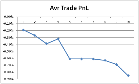
The system was backtested on SPY from 1993 to the present. Graph below shows the average trade PnL as a function of number of days in the trade,

Hedging system for protecting stock portfolios
Average trade PnL vs. days in trade

We observe that if we exit this trade within 4 days of entry, the average loss (i.e. the cost of hedging) is in the range of -0.2% to -0.4%, i.e. an average of -0.29% per trade. From day 5, the loss becomes much larger (more than double), in the range of -0.6% to -0.85%. The smaller average loss incurred during the first 4 days might be a result of the fat-tail behaviour.

This test shows that there is some evidence that the scaling behaviour demonstrated in Ref [1] still holds true today, and it manifested itself in this system.  More rigorous research should be conducted to confirm this.

 References

[1] Gopikrishnan P, Plerou V, Nunes Amaral  LA, Meyer M, Stanley HE, Scaling of the distribution of fluctuations of financial market indices, Phys Rev E, 60, 5305 (1999).

VIX Mean Reversion After a Volatility Spike

In a previous post, we showed that the spot volatility index, VIX, has a strong mean reverting tendency. In this follow-up installment we’re going to further investigate the mean reverting properties of the VIX. Our primary goal is to use this study in order to aid options traders in positioning and/or hedging their portfolios.

To do so, we first calculate the returns of the VIX index. We then determine the quantiles of the return distribution. The table below summarizes the results.

Quantile 50% 75% 85% 95%
Volatility spike -0.31% 3.23% 5.68% 10.83%

We next calculate the returns of the VIX after a significant volatility spike. We choose round-number spikes of 3% and 6%, which roughly correspond to the 75% and 85% quantiles, respectively. Finally, we count the numbers of occurrences of negative VIX returns, i.e. instances where it decreases to below its initial value before the spike.

Tables below present the numbers of occurrences 1, 5, 10 and 20 days out. As in a previous study, we divide the volatility environment into 2 regimes: low (VIX<=20) and high (VIX>20). We used data from January 1990 to December 2017.

VIX spike > 3%
Days out All cases VIX<=20 VIX>20
1 56.1% 54.9% 58.1%
5 59.7% 58.4% 61.8%
10 60.3% 57.0% 65.8%
20 61.6% 57.0% 69.5%


VIX spike > 6%
Days out All cases VIX<=20 VIX>20
1 58.2% 56.9% 60.3%
5 62.5% 62.0% 63.3%
10 64.0% 61.7% 67.6%
20 65.9% 61.4% 73.2%

We observe the followings,

  • The greater the spike, the stronger the mean reversion. For example, for all volatility regimes (“all cases”), 10 days after the initial spike of 3%, the VIX decreases 60% of the time, while after a 6% volatility spike it decreases 64% of the time,
  • The mean reversion is stronger in the high volatility regime. For example, after a volatility spike of 3%, if the VIX was initially low (<20), then after 10 days it reverts 57% of the time, while if it was high (>20) it reverts 66% of the time,
  • The longer the time frame (days out), the stronger the mean reversion.

The implication of this study is that

  • After a volatility spike, the risk of a long volatility position, especially if VIX options are involved, increases. We would better off reducing our vega exposure or consider taking profits, at least partially,
  • If we don’t have a position prior to a spike, we then can take advantage of its quick mean reversion by using bounded-risk options positions.

A Simple System For Hedging Long Portfolios

In this post, we are going to examine a trading system with the goal of using it as a hedge for long equity exposure. To this end, we test a simple, short-only momentum system. The rules are as follows,

Short at the close when Close of today < lowest Close of the last 10 days

Cover at the close when Close of today > lowest Close of the last 10 days

The Table below presents results for SPY from 1993 to the present. We performed the tests for 2 different volatility regimes: low (VIX<=20) and high (VIX>20). Note that we have tested other lookback periods and VIX filters, but obtained qualitatively the same results.

Number of Trades Winner Average trade PnL
All 455 24.8% -0.30%
VIX<=20 217 23.5% -0.23%
VIX>20 260 26.5% -0.37%

It can be seen that the average PnL for all trades is -0.3%, so overall shorting SPY is a losing trade. This is not surprising, since in the short term the SP500 exhibits a strong mean reverting behavior, and in a long term it has a positive drift.

We still expected that when volatility is high, the SP500 would exhibit some momentum characteristics and short selling would be profitable. The result indicates the opposite. When VIX>20, the average trade PnL is -0.37%, which is higher (in absolute value) than the average trade PnL for the lower volatility regime and all trades combined (-0.23% and -0.3% respectively).  This result implies that the mean reversion of the SP500 is even stronger when the VIX is high.

The average trade PnL, however, does not tell the whole story. We next look at the maximum favorable excursion (MFE). Table below summarizes the results

Average Median Max
VIX<=20 0.83% 0.44% 10.59%
VIX>20 1.62% 0.73% 24.25%

Despite the fact that the short SPY trade has a negative expectancy, both the average and median MFEs are positive. This means that the short SPY trades often have large unrealized gains before they are exited at the close.  Also, as volatility increases, the average, median and largest MFEs all increase.  This is consistent with the fact that higher volatility means higher risks.

The above result implies that during a sell-off, a long equity portfolio can suffer a huge drawdown before the market stabilizes and reverts. Therefore, it’s prudent to hedge long equity exposure, especially when volatility is high.

An interesting, related question arises: should we use options or futures to hedge, which one is cheaper? Based on the average trade PnL of -0.37% and gamma rent derived from the lower bound of the VIX, a back of the envelope calculation indicated that hedging using futures appears to be cheaper.

Is a 4% Down Day a Black Swan?

On February 5, the SP500 experienced a drop of 4% in a day. We ask ourselves the question:  is a one-day 4% drop a common occurrence? The table below shows the number of 4% (or more) down days since 1970.

   4% down 4% down and bullish
From 1970 40 5


On average, a 4% down day occurred each 1.2 years, which is probably not a rare occurrence.

We next counted the number of days when the SP500 dropped 4% or more during a bull market. We defined the bull market as price > 200-Day simple moving average.  Since 1970 there have been 5 occurrences, i.e. on average once every 10 years. We don’t know whether this qualifies as a black swan event, but a drop of more than 4% during a bull market is indeed very rare.

The table below shows the dates of such  occurrences. It’s interesting to note that before the February 5 event, the last two 4% drops when price> 200-day SMA occurred around the dot-com period.

Date %change
September 11, 1986 -4.8
October 13, 1989 -6.1
October 27, 1997 -6.9
April 14, 2000 -5.8
February 5, 2018 -4.1


Correlation Between SPX and VIX

Last week, many traders noticed that there was a divergence between SPX and VIX. It’s true if we look at the price series. Graph below shows the 20-day rolling correlation between SPX and VIX prices for the last year. We can see that the correlation has been positive lately.

volatility arbitrage trading strategies
20-day rolling correlation SPX-VIX prices, ending Jan 26 2018

However, if we look at the correlation between SPX daily returns and VIX changes, it’s more or less in line with the long term average of -0.79. So the divergence was not significant.

volatility trading strategies based on correlation
20-day rolling correlation SPX return -VIX changes ending Jan 26 2018

The implied volatility (VIX) actually tracked the realized volatility (not shown) quite well. The latter happened to increase when the market has moved to the upside since the beginning of the year.

Mean Reverting and Trending Properties of SPX and VIX

In the previous post, we looked at some statistical properties of the empirical distributions of spot SPX and VIX. In this post, we are going to investigate the mean reverting and trending properties of these indices. To do so, we are going to calculate their Hurst exponents.

There exist a variety of techniques for calculating the Hurst exponent, see e.g. the Wikipedia page. We prefer the method presented in reference [1] as it could be related to the variance of a Weiner process which plays an important role in the options pricing theory. When H=0.5, the underlying is said to be following a random walk (GBM) process. When H<0.5, the underlying is considered mean reverting, and when H>0.5 it is considered trending.

Table below presents the Hurst exponents for SPX, VIX and VXX. The data used for SPX and VIX is the same as in the previous post. The data for VXX is from Feb 2009 to the present. We display Hurst exponents for 2 different ranges of lags: short term (5-20 days) and long term (200-250 days).

Lag (days) SPX VIX VXX
5-20 0.45 0.37 0.46
200-250 0.51 0.28 0.46

We observe that SPX is mean reverting in a short term (average H=0.45) while trending in a long term (average H=0.51). This is consistent with our experience.

The result for spot VIX (non tradable) is interesting. It’s mean reverting in a short term (H=0.37) and strongly mean reverting in a long term (H=0.28).

As for VXX, the result is a little bit surprising. We had thought that VXX should exhibit some trendiness in a certain timeframe.  However, VXX is mean reverting in both short- and long-term timeframes (H=0.46).

Knowing whether the underlying is mean reverting or trending can improve the efficiency of the hedging process.

References

[1] T. Di Matteo et al. Physica A 324 (2003) 183-188

Statistical Distributions of the Volatility Index

VIX related products (ETNs, futures and options) are becoming popular financial instruments, for both hedging and speculation, these days.  The volatility index VIX was developed in the early 90’s. In its early days, it led the derivative markets. Today the dynamics has changed.  Now there is strong evidence that the VIX futures market leads the cash index.

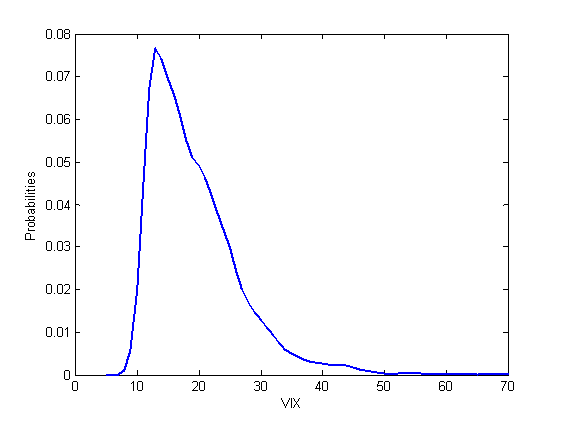
In this post we are going to look at some statistical properties of the spot VIX index. We used data from January 1990 to May 2017. Graph below shows the kernel distribution of spot VIX.

volatility trading strategies: VIX distribution is not normal
Kernel distribution of the spot VIX index

It can be seen that the distribution of spot VIX is not normal, and it possesses a right tail.

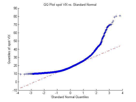
We next look at the Q-Q plot of spot VIX. Graph below shows the Q-Q plot. It’s apparent that the distribution of spot VIX is not normal. The right-tail behavior can also be seen clearly. Intuitively, it makes sense since the VIX index often experiences very sharp, upward spikes.

volatility arbitrage: Q-Q plot of spot volatility index
Q-Q plot of spot VIX vs. standard normal

It is interesting to observe that there exists a natural floor around 9% on the left side, i.e. historically speaking, 9% has been a minimum for spot VIX.

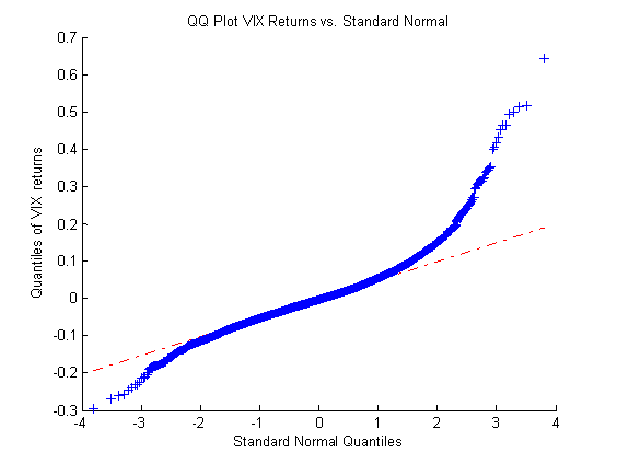
We now look at the distribution of VIX returns. Graph below shows the Q-Q plot of VIX returns. We observe that the return distribution is closer to normal than the spot VIX distribution. However, it still exhibits the right tail behavior.

Relative value arbitrage: distribution of VIX returns
Q-Q plot of VIX returns vs. standard normal

It’s interesting to see that in the return space, the VIX distribution has a left tail similar to the equity indices. This is probably due to large decreases in the spot VIX after sharp volatility spikes.

The natural floor of the spot VIX index and its left tail in the return space can lead to construction of good risk/reward trading strategies.

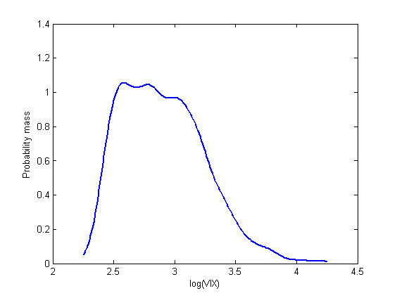
UPDATE: we plotted probability mass function of spot VIX on the log scale. Graph below shows that spot VIX spent most of its time in the 12%-22% (log(VIX)=2.5 to 3.1) region during the sample period.

options trading strategies: distribution of the volatility index
Kernel distribution on the log scale

Are Short Out-of-the-Money Put Options Risky? Part 2: Dynamic Case

This post is the continuation of the previous one on the riskiness of OTM vs. ATM short put options and the effect of leverage on the risk measures. In this installment we’re going to perform similar studies with the only exception that from inception until maturity the short options are dynamically hedged. The simulation methodology and parameters are the same as in the previous study.

As a reference, results for the static case are replicated here:

ATM  (K=100)   OTM (K=90)
Margin Return Variance VaR Return Variance VaR
100% 0.0171 0.0075 0.1940 0.0118 0.0031 0.1303
50% 0.0370 0.0292 0.3844 0.0206 0.0133 0.2783
15% 0.1317 0.3155 1.2589 0.0679 0.1502 0.9339


Table below summarizes the results for the dynamically hedged case

ATM  (K=100)   OTM (K=90)
Margin Return Variance VaR Return Variance VaR
100% -0.0100 1.9171E-05 0.0073 -0.0059 1.4510E-05 0.0062
50% -0.0199 7.6201E-05 0.0145 -0.0118 5.8016E-05 0.0121
15% -0.0660 8.7943E-04 0.0480 -0.0400 6.5201E-04 0.0424


From the Table above, we observe that:

  • Similar to the static case, delta-hedged OTM put options are less risky than the ATM counterparts. However, the reduction in risk is less significant. This is probably due to the fact that delta hedging itself already reduces the risks considerably (see below).
  • Leverage also increases risks.

It is important to note that given the same notional amount, a delta-hedged position is less risky than a static position. For example, the VaR of a static, cash-secured (m=100%) short put position is 0.194, while the VaR of the corresponding dynamically-hedged position is only 0.0073. This explains why proprietary trading firms and hedge funds often engage in the practice of dynamic hedging.

Finally, we note that while Value at Risk takes into account the tail risks to some degree, it’s probably not the best measure of tail risks. Using other risk measures that better incorporate the tail risks can alter the results and lead to different conclusions.