The Weekend Effect in The Market Indices

The weekend (or Monday) effect in the stock market refers to the phenomenon where stock returns exhibit different patterns on Mondays compared to the rest of the week. Historically, there has been a tendency for stock prices to be lower on Mondays. Various theories attempt to explain the weekend effect, including investor behaviour, news over the weekend, and the impact of events occurring during the weekend on market sentiment.

In this post, we’ll investigate the weekend effect in the market indices using data from Yahoo Finance spanning January 2001 to December 2023. Specifically we choose SPY, which tracks the SP500, and the volatility index, VIX.

Our strategy involves taking a long position in SPY at Friday’s close and exiting the position at Monday’s close, or the next business day’s close if Monday is a holiday. The figure below depicts the cumulative, non-compounded return of the strategy.

Cumulative return of holding SPY over the weekend

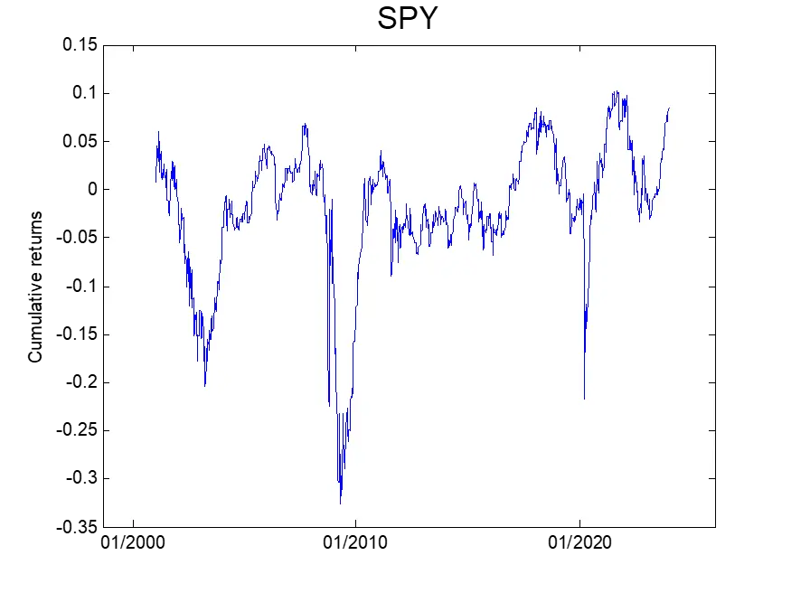
From the figure, we observe that holding SPY over the weekend resulted in negative returns during the GFC, Covid pandemic, and the recent 2022 bear market. The overall return is flat-ish, indicating a low reward/risk ratio for holding the SPY over the weekend.

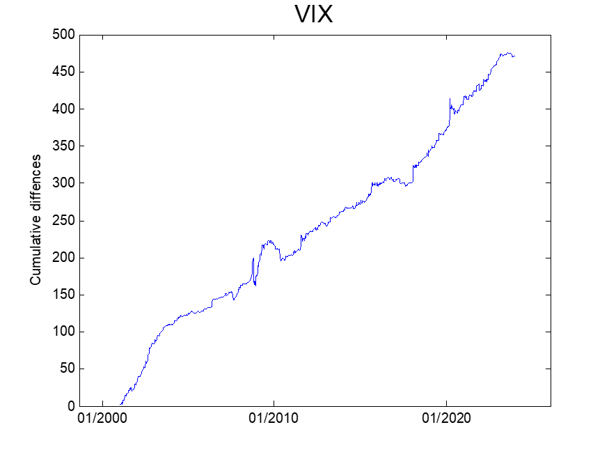
Next, we analyze the change in the VIX index during the weekend. We compute the change in the VIX index from Friday’s close to the close of the next business day and plot the cumulative difference in the figure below. A noticeable upward trend is observed in the cumulative difference. This result indicates that maintaining a long vega/gamma position over the weekend would offer a favourable reward-to-risk trade.

Cumulative difference of the VIX index over the weekend

It’s important to note, however, that investing directly in the spot VIX is not possible. To confirm and capitalize on the weekend effect in the volatility index, one would have to:

  • Trade a volatility ETN, or
  • Trade a delta-hedged option position

Each of these approaches introduces additional risk factors, specifically 1- the roll yield and contango, and 2- PnL originating from gamma and theta. These issues will be addressed in the next installment.

Which System Has The Lowest Risk of Ruin?

Would you rather choose a trading system that wins small amounts most of the time but when it loses, the loss is big? Or would you rather choose a trading system that loses small amounts most of the time but when it wins, the gain is big? In this blog post, we will examine such systems from the risk of ruin perspective.

The risk of ruin is the probability of an investor’s eventual bankruptcy due to a series of losses that exceed his/her capital. It is essential for any trader to understand their risk of ruin, as it will heavily influence the trading system they ultimately develop.

We will use Monte Carlo simulations to perform our analysis. We examine the following 3 trading systems

System Percent win

Win

Loss

Expectancy

A

10%

$90

$10

0

B

50%

$18

$18

0

C

90%

$10

$90

0

For each system, we generate 1000 trades randomly. If a trade is a win, then we’ll make the amount in the column “Win”, and if it’s a loss, then we’ll lose the amount in the column “Loss”. For example, for system A, if we win, we make $90 and if we lose, we lose $10.

To simplify the analysis, we assume that all 3 systems have zero expectancies. The total winning/losing amounts of each system equal $9000. We start with an initial capital of $1000. The figure below shows the first 100 simulated paths for system A. It’s clear that the system has zero expectancy as the terminal wealth equals the starting capital.

To calculate the probability of ruin, we first count the number of paths that go below $0 at any time in their evolutions. We then divide the number of such paths by the number of iterations which is 10000.

The table below summarizes the results.

System

Risk of Ruin

A

10.22%

B

0.18%

C

9.95%

We can see from the results that system B has the lowest probability of ruin. This confirmed that traders should avoid systems that have high win percentages but suffer occasional large losses. Short volatility trading systems are in this category. Traders should also avoid systems that have low percentage win rates.

Asset Price Dynamics and Trading Strategy’s PnL Volatility

In a previous post, we discussed how the dynamics of assets are priced in the options prices. We recently came across a newly published article [1] that explored the same topic but from a different perspective that does not involve options.

The conclusion of the new article [1] is consistent with the previous one [2]; that is, the volatilities of mean-reverting assets are smaller than those of assets that follow the GBM process. The reverse applies to trending assets.

In this post, we are going to investigate whether the mean-reverting/trending property of an asset has any impact on a trading strategy’s PnL volatility.

To do this, we first generate asset prices using Monte Carlo simulations. We evolve the asset prices in both mean-reverting and trending regimes for 500 days. We then apply a simple trading system to the simulated asset prices. The trading system is as follows,

Go LONG when the Relative Strength Index <40, SHORT when the Relative Strength Index >70

The picture below shows the Autocorrelation Functions (ACF) of the asset returns. Panels (a) and (b) present ACFs of the trending and mean-reverting assets respectively. It’s clear that the assets are trending and mean-reverting at lag 3, respectively.

Autocorrelation Functions of asset returns

The picture below shows the simulated equity curves of the trading strategy applied to the trending (a) and mean-reverting (b) assets. The starting capital is $100 in both cases.

Equity curves of the trading strategy

Visually, we do not observe any difference in terms of PnL dispersion. Indeed, the standard deviation of the terminal wealth at day 500 is $18.9 in the case of the trending asset (a), and $17.3 in the case of the mean-reverting asset (b). Is the difference statistically significant? We don’t think so.

This numerical experiment shows that the PnL volatility of a trading strategy has little to do with the underlying asset’ mean-reverting/trending property. Maybe it depends more on the strategy itself? (Note that in this example, we utilize a mean-reverting strategy). What would happen at the portfolio level?

References

[1] L. Middleton, J. Dodd, S. Rijavec, Trading styles and long-run variance of asset prices, 2021, arXiv:2109.08242

[2] Liao, S.L. and Chen, C.C. (2006), The valuation of European options when asset returns are autocorrelated, Journal of Futures Markets, 26, 85-102.

Correlation Between the VVIX and VIX indices

The VIX index is an important market indicator that everyone is watching. VVIX, on the other hand, receives less attention. In this post, we are going to take a look at the relationship between the VIX and VVIX indices.

While the VIX index measures the volatility risks, VVIX measures the volatility-of-volatility risks. Its calculation methodology is similar to the VIX’s except that instead of using SPX options it uses VIX options.

To study the relationship between these 2 indices, we first calculated the rolling 20-days correlation of the VIX and VVIX returns from January 2007 to March 2020. The median value of correlation is 0.807 and 25% quantile is 0.66

The figure below presents the rolling 20-days VIX/VVIX correlation for the last 2 years. We also superimposed SPY on the chart. We observe that the correlation is usually high but there are periods where it decreases significantly. The current period is one of those.

Correlation Between the VVIX and VIX indices
Correlation between the VVIX and VIX indices

The next figure shows the scatter plot of VVIX returns vs. VIX returns. It’s observed that there is a significant population where VIX and VVIX returns are of opposite signs.  We subsequently calculated the number of instances where VIX and VVIX move in the opposite direction. This indeed happens 22% of the time.

VVIX returns vs. VIX returns

Some implications of this study are:

  • Although the correlation between VIX and VVIX appears to be high, there is a significant number of instances where VIX and VVIX move in the opposite direction. So it’s fair to say that VVIX follows separate price dynamics which is different from the VIX. In other words, VVIX prices in different risks.
  • Long VIX options or SPX back spreads are not always a good hedge for an equity portfolio. The hedge can break down.
  • At times it’s cheaper to hedge a long equity portfolio using SPX options; at times it’s cheaper using VIX options.
  • The speed of VIX mean reversion is greater when VIX is high as compared to when VIX is low.

Differences Between the VIX Index And At-the-Money Implied Volatility

When trading options, we often use the VIX index as a measure of volatility to help enter and manage positions. This works most of the time. However, there exist some differences between the VIX index and at-the-money implied volatility (ATM IV). In this post, we are going to show such a difference through an example. Specifically, we study the relationship between the implied volatility and forward realized volatility (RV) [1] of SP500. We utilize data from April 2009 to December 2018.

Recall that the VIX index

  • Is a model-independent measure of volatility,
  • It contains a basket of options, including out-of-the-money options. Therefore it incorporates the skew effect to some degree.

Plot below shows RV as a function of the VIX index.

Volatility trading strategies volatility arbitrage

We observe that a high VIX index will usually lead to a higher realized volatility. The correlation between RV and the VIX is 0.6397.

For traders who manage fixed-strike options, the use of option-specific implied volatilities, in conjunction with the VIX index, should be considered. In this example, we calculate the one-month at-the-money implied volatility using SPY options. Unlike the VIX index, the fixed-strike volatilities are model-dependent. To simplify, we use the Black-Scholes model to determine the fixed-strike, fixed-maturity implied volatilities.  The constant-maturity, floating-strike implied volatilities are then calculated by interpolation.

Plot below shows RV as a function of ATM IV.

Volatility trading strategies implied volatility

We observe similar behaviour as in the previous plot. However, the correlation (0.5925) is smaller. This is probably due to the fact that ATM IV does not include the skew.

In summary:

  • There are differences between the VIX index and at-the-money implied volatility.
  • Higher implied volatilities (as measured by the VIX or ATM IV) will usually lead to higher RV.

Footnotes

[1] In this example, forward realized volatility is historical volatility shifted by one month.

A Simple Hedging System With Time Exit

This post is a follow-up to the previous one on a simple system for hedging long exposure during a market downturn. It was inspired by H. Krishnan’s book The Second Leg Down, in which he referred to an interesting research paper [1] on the power-law behaviour of the equity indices.  The paper states,

We find that the distributions for ∆t ≤4 days (1560 mins) are consistent with a power-law asymptotic behavior, characterized by an exponent α≈ 3, well outside the stable Levy regime 0 < α <2. .. For time scales longer than ∆t ≈4 days, our results are consistent with slow convergence to Gaussian behavior.

Basically, the paper says that the equity indices exhibit fatter tails in shorter time frames, from 1 to 4 days. We apply this idea to our breakout system.  We’d like to see whether the 4-day rule manifests itself in this simple strategy. To do so, we use the same entry rule as before, but with a different exit rule.   The entry and exit rules are as follows,

Short at the close when Close of today < lowest Close of the last 10 days

Cover at the close T days after entry (T=1,2,… 10)

The system was backtested on SPY from 1993 to the present. Graph below shows the average trade PnL as a function of number of days in the trade,

Hedging system for protecting stock portfolios
Average trade PnL vs. days in trade

We observe that if we exit this trade within 4 days of entry, the average loss (i.e. the cost of hedging) is in the range of -0.2% to -0.4%, i.e. an average of -0.29% per trade. From day 5, the loss becomes much larger (more than double), in the range of -0.6% to -0.85%. The smaller average loss incurred during the first 4 days might be a result of the fat-tail behaviour.

This test shows that there is some evidence that the scaling behaviour demonstrated in Ref [1] still holds true today, and it manifested itself in this system.  More rigorous research should be conducted to confirm this.

 References

[1] Gopikrishnan P, Plerou V, Nunes Amaral  LA, Meyer M, Stanley HE, Scaling of the distribution of fluctuations of financial market indices, Phys Rev E, 60, 5305 (1999).

VIX Mean Reversion After a Volatility Spike

In a previous post, we showed that the spot volatility index, VIX, has a strong mean reverting tendency. In this follow-up installment we’re going to further investigate the mean reverting properties of the VIX. Our primary goal is to use this study in order to aid options traders in positioning and/or hedging their portfolios.

To do so, we first calculate the returns of the VIX index. We then determine the quantiles of the return distribution. The table below summarizes the results.

Quantile 50% 75% 85% 95%
Volatility spike -0.31% 3.23% 5.68% 10.83%

We next calculate the returns of the VIX after a significant volatility spike. We choose round-number spikes of 3% and 6%, which roughly correspond to the 75% and 85% quantiles, respectively. Finally, we count the numbers of occurrences of negative VIX returns, i.e. instances where it decreases to below its initial value before the spike.

Tables below present the numbers of occurrences 1, 5, 10 and 20 days out. As in a previous study, we divide the volatility environment into 2 regimes: low (VIX<=20) and high (VIX>20). We used data from January 1990 to December 2017.

VIX spike > 3%
Days out All cases VIX<=20 VIX>20
1 56.1% 54.9% 58.1%
5 59.7% 58.4% 61.8%
10 60.3% 57.0% 65.8%
20 61.6% 57.0% 69.5%


VIX spike > 6%
Days out All cases VIX<=20 VIX>20
1 58.2% 56.9% 60.3%
5 62.5% 62.0% 63.3%
10 64.0% 61.7% 67.6%
20 65.9% 61.4% 73.2%

We observe the followings,

  • The greater the spike, the stronger the mean reversion. For example, for all volatility regimes (“all cases”), 10 days after the initial spike of 3%, the VIX decreases 60% of the time, while after a 6% volatility spike it decreases 64% of the time,
  • The mean reversion is stronger in the high volatility regime. For example, after a volatility spike of 3%, if the VIX was initially low (<20), then after 10 days it reverts 57% of the time, while if it was high (>20) it reverts 66% of the time,
  • The longer the time frame (days out), the stronger the mean reversion.

The implication of this study is that

  • After a volatility spike, the risk of a long volatility position, especially if VIX options are involved, increases. We would better off reducing our vega exposure or consider taking profits, at least partially,
  • If we don’t have a position prior to a spike, we then can take advantage of its quick mean reversion by using bounded-risk options positions.

A Simple System For Hedging Long Portfolios

In this post, we are going to examine a trading system with the goal of using it as a hedge for long equity exposure. To this end, we test a simple, short-only momentum system. The rules are as follows,

Short at the close when Close of today < lowest Close of the last 10 days

Cover at the close when Close of today > lowest Close of the last 10 days

The Table below presents results for SPY from 1993 to the present. We performed the tests for 2 different volatility regimes: low (VIX<=20) and high (VIX>20). Note that we have tested other lookback periods and VIX filters, but obtained qualitatively the same results.

Number of Trades Winner Average trade PnL
All 455 24.8% -0.30%
VIX<=20 217 23.5% -0.23%
VIX>20 260 26.5% -0.37%

It can be seen that the average PnL for all trades is -0.3%, so overall shorting SPY is a losing trade. This is not surprising, since in the short term the SP500 exhibits a strong mean reverting behavior, and in a long term it has a positive drift.

We still expected that when volatility is high, the SP500 would exhibit some momentum characteristics and short selling would be profitable. The result indicates the opposite. When VIX>20, the average trade PnL is -0.37%, which is higher (in absolute value) than the average trade PnL for the lower volatility regime and all trades combined (-0.23% and -0.3% respectively).  This result implies that the mean reversion of the SP500 is even stronger when the VIX is high.

The average trade PnL, however, does not tell the whole story. We next look at the maximum favorable excursion (MFE). Table below summarizes the results

Average Median Max
VIX<=20 0.83% 0.44% 10.59%
VIX>20 1.62% 0.73% 24.25%

Despite the fact that the short SPY trade has a negative expectancy, both the average and median MFEs are positive. This means that the short SPY trades often have large unrealized gains before they are exited at the close.  Also, as volatility increases, the average, median and largest MFEs all increase.  This is consistent with the fact that higher volatility means higher risks.

The above result implies that during a sell-off, a long equity portfolio can suffer a huge drawdown before the market stabilizes and reverts. Therefore, it’s prudent to hedge long equity exposure, especially when volatility is high.

An interesting, related question arises: should we use options or futures to hedge, which one is cheaper? Based on the average trade PnL of -0.37% and gamma rent derived from the lower bound of the VIX, a back of the envelope calculation indicated that hedging using futures appears to be cheaper.

Is a 4% Down Day a Black Swan?

On February 5, the SP500 experienced a drop of 4% in a day. We ask ourselves the question:  is a one-day 4% drop a common occurrence? The table below shows the number of 4% (or more) down days since 1970.

   4% down 4% down and bullish
From 1970 40 5


On average, a 4% down day occurred each 1.2 years, which is probably not a rare occurrence.

We next counted the number of days when the SP500 dropped 4% or more during a bull market. We defined the bull market as price > 200-Day simple moving average.  Since 1970 there have been 5 occurrences, i.e. on average once every 10 years. We don’t know whether this qualifies as a black swan event, but a drop of more than 4% during a bull market is indeed very rare.

The table below shows the dates of such  occurrences. It’s interesting to note that before the February 5 event, the last two 4% drops when price> 200-day SMA occurred around the dot-com period.

Date %change
September 11, 1986 -4.8
October 13, 1989 -6.1
October 27, 1997 -6.9
April 14, 2000 -5.8
February 5, 2018 -4.1


Correlation Between SPX and VIX

Last week, many traders noticed that there was a divergence between SPX and VIX. It’s true if we look at the price series. Graph below shows the 20-day rolling correlation between SPX and VIX prices for the last year. We can see that the correlation has been positive lately.

volatility arbitrage trading strategies
20-day rolling correlation SPX-VIX prices, ending Jan 26 2018

However, if we look at the correlation between SPX daily returns and VIX changes, it’s more or less in line with the long term average of -0.79. So the divergence was not significant.

volatility trading strategies based on correlation
20-day rolling correlation SPX return -VIX changes ending Jan 26 2018

The implied volatility (VIX) actually tracked the realized volatility (not shown) quite well. The latter happened to increase when the market has moved to the upside since the beginning of the year.