Momentum strategies have long been a cornerstone of investing, relying on the premise that past winners continue to outperform in the near future. This post explores the effectiveness of momentum strategies, analyzing their ability to generate abnormal returns and assessing their viability in different markets. While previous research has demonstrated the profitability of momentum strategies, recent evidence suggests a decline in return predictability. We then examine how incorporating drawdown control as a risk management tool can enhance performance.
Momentum Trading Strategies Across Capital Markets
Momentum trading is a popular investment strategy. Reference [1] reviewed momentum trading across various markets, from developing to developed countries.
Findings
– The momentum strategy involves investors buying stocks that have shown strong performance, anticipating continued positive performance.
– According to the study, most capital market investors employ the momentum strategy, although its implementation varies.
– This variability suggests inefficiencies in several capital markets’ development.
– The literature review reveals various interpretations and implementations of the momentum strategy.
– Overall, the findings indicate that momentum strategies are prevalent across global capital markets, including both developed and developing countries.
– These strategies typically manifest over the short term, often observed and tested over periods of at least twelve months.
Reference
[1] G. Syamni, Wardhia, D.P. Sari, B. Nafis, A Review of Momentum Strategy in Capital Market, Advances in Social Science, Education and Humanities Research, volume 495, 2021
Is the Momentum Anomaly Still Present in the Financial Markets?
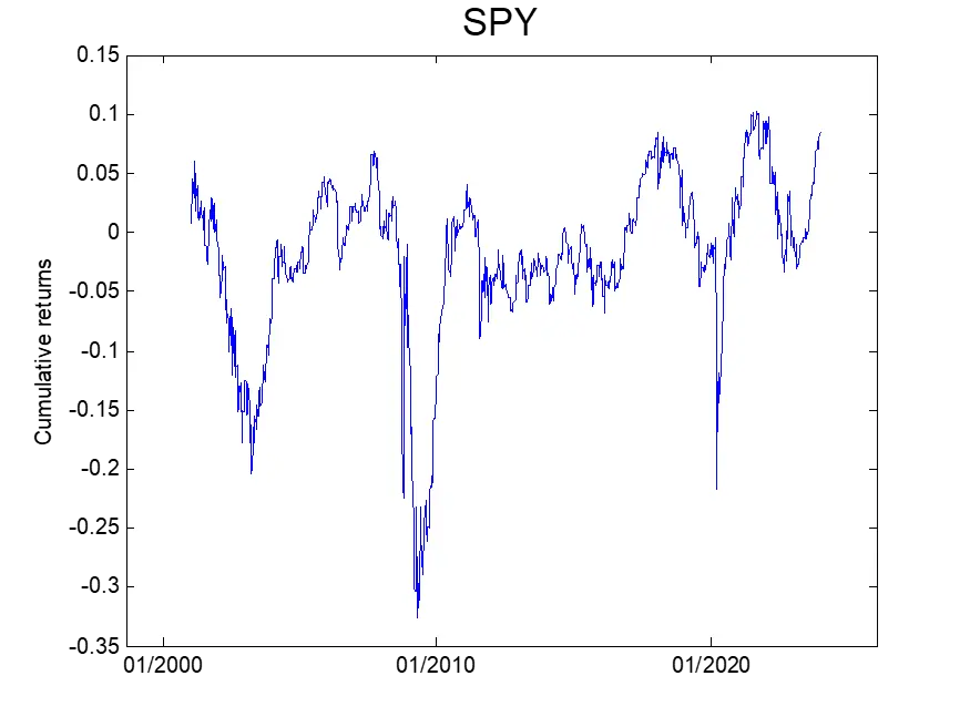
Reference [2] examined whether the momentum anomaly still exists in the financial markets these days. Specifically, it analyzed the performance of a momentum trading strategy where we determined each asset’s excess return over the past 12 months. If the return is positive, the financial instrument is bought, and if negative, the financial instrument is sold.
Findings
– This paper expands on existing research on trend-following strategies.
– The study confirms the presence of the momentum anomaly during the sample period, showing statistically significant evidence.
– A time series momentum strategy, using the methodology of Moskowitz et al. yields a Sharpe ratio of 0.75, slightly higher than the 0.73 Sharpe ratio from a passive long investment in the same instruments.
– Evidence suggests a decline in return predictability over the past decade, with negative alpha from January 2009 to December 2021 when dividing the sample into three subperiods.
– The decline in return predictability indicates a weakening momentum anomaly.
– Incorporating drawdown control as a risk management measure significantly improves strategy performance, increasing the Sharpe ratio to 1.07 compared to 0.75 without drawdown control.
Reference
[2] David S. Hammerstad and Alf K. Pettersen, The Momentum Anomaly: Can It Still Outperform the Market?, 2022, Department of Finance, BI Norwegian Business School
Closing Thoughts
These studies confirm the relevance of momentum strategies but highlight their declining effectiveness since 2009, suggesting increased market efficiency. While time-series momentum still generates returns, its predictive power has weakened. However, incorporating drawdown control significantly improves performance, making risk management essential for sustaining profitability in evolving market conditions.